Logo styles
Which mark would feel at home on your business? Compare the choices from our branding questionnaire. Some describe the shape of a logo, others the finish of an app icon.
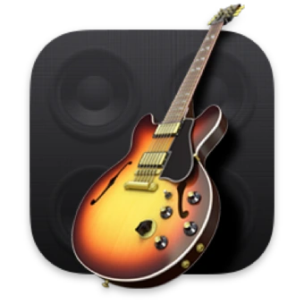
Skeuomorphism
Pictured: GarageBand
Strings, tuning pegs and reflections make this app icon feel like a guitar you could pick up.
Examples: GarageBand, Apple Books, Apple Contacts
Read the design guide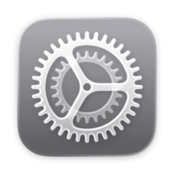
Neomorphism
Pictured: Apple System Settings
Look at the pale rim and the shadow beneath the gear. This raised-surface detail shows how a symbol can feel pressed out of its background.
Examples: Apple System Settings, Apple Calculator on macOS Big Sur, Apple Messages on macOS Big Sur
Read the design guide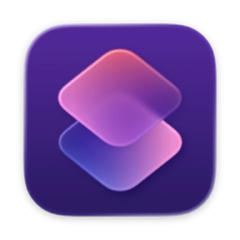
Glassmorphism
Pictured: Apple Shortcuts
Two coloured tiles overlap. Soft highlights and translucent edges make the upper tile look like frosted glass.
Examples: Apple Shortcuts, Windows Vista, Apple Photos
Read the design guide
Claymorphism
Pictured: Reddit
Snoo’s rounded head, antenna and soft shading make the mascot look moulded by hand.
Examples: Reddit’s 3D Snoo, Android’s 3D robot, Duolingo’s 3D Duo
Read the design guide
Minimalism
Pictured: Nike
One sweeping shape changes from a heavy curve to a fine point. Your eye follows it forward.
Examples: Apple, Netflix, Mastercard, Uber, Spotify
Read the design guide
Maximalism
Pictured: Unilever
From a distance you see a U. Look closer and a whole collection of tiny illustrations comes into focus.
Examples: Unilever, Porsche, Versace
Read the design guide
Brutalism
Pictured: Black Flag
Four blunt, staggered bars give this punk identity a raw visual rhythm. Their heavy edges are the detail to look at here.
Examples: Black Flag, Public Image Ltd’s PiL, Run-DMC
Read the design guide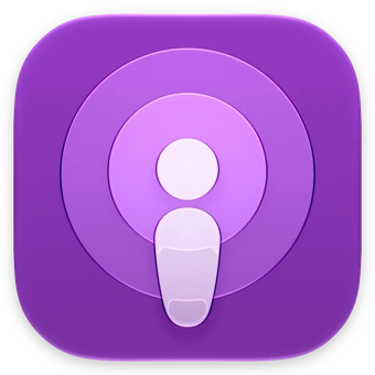
Liquid Glass
Pictured: Apple Podcasts
The central figure and rings catch light along their edges. This still shows Apple’s glass treatment for its app icons.
Examples: Apple Podcasts, Apple Photos, Apple Camera
Read the design guide
Spatial UI
Pictured: Apple Photos on visionOS
The petals sit in front of a round base. On a spatial display, separate layers give the icon depth as you look at it.
Examples: Apple Photos on visionOS, Apple Notes on visionOS, Apple Safari on visionOS
Read the design guide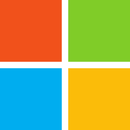
Flat design
Pictured: Microsoft
Four blocks of solid colour read clearly without highlights, shadows or perspective.
Examples: Microsoft, Google Chrome’s flat icon, Slack
Read the design guide
Geometric
Pictured: Figma
Follow the circles and semicircles down the F. Their repeated curves make several colours feel like one family.
Examples: Figma, Mitsubishi, Mastercard
Read the design guide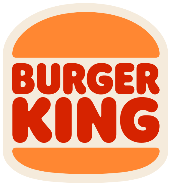
Retro / Vintage
Pictured: Burger King
Rounded lettering fits between two bun shapes. The soft edges give the mark the warmth of an old diner sign.
Examples: Burger King, Coca-Cola, Levi’s red tab
Read the design guide
Hand-drawn / Organic
Pictured: Debian
The spiral has the broken edge of a brushstroke. Its small irregularities give it a human touch.
Examples: Debian, Disney, Innocent Drinks
Read the design guide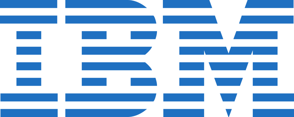
Typographic
Pictured: IBM
The letters carry the identity. Horizontal stripes run through all three, giving the name a rhythm of its own.
Examples: IBM, FedEx, Google
Read the design guide
Illustrative / Mascot
Pictured: Linux
Tux gives a software project a face. A seated pose and rounded belly make the penguin feel approachable.
Examples: Linux, Duolingo, Michelin
Read the design guide
Luxury / Elegant
Pictured: Chanel
Bold capitals stand on a single line with carefully spaced gaps. The spare lettering gives the name a composed, formal presence.
Examples: Chanel, Cartier, Dior
Read the design guide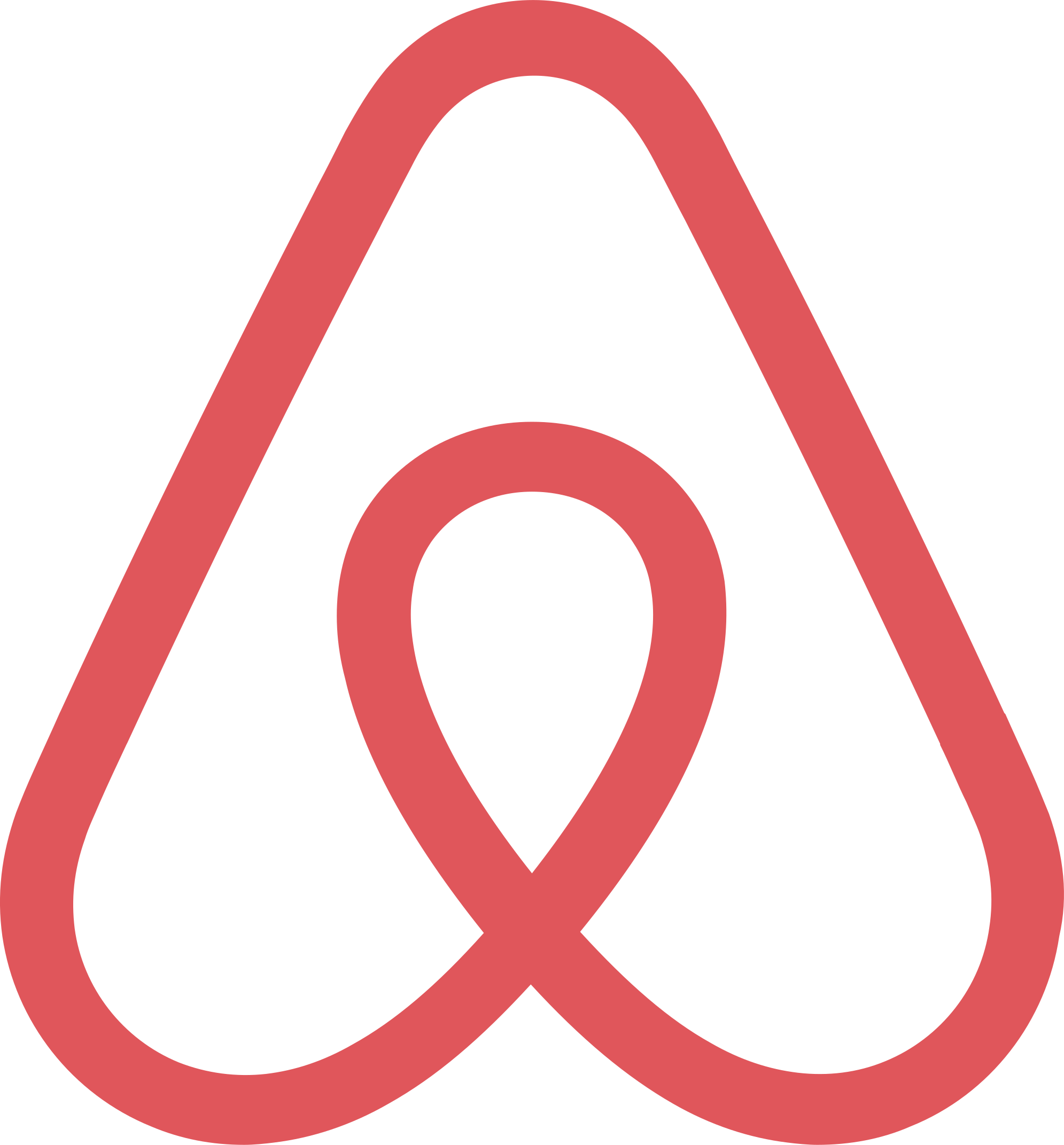
Abstract
Pictured: Airbnb
One continuous loop suggests several things at once. A viewer can recognise the outline before deciding what it means.
Examples: Airbnb, Chase, Nike
Read the design guide
Brand marks are shown as visual references. Artwork credits