Spatial UI
A spatial icon is built to be seen in layers. As the viewing angle changes, the foreground and background can appear to shift against each other. The distance between them becomes part of the design.
Examples to look at
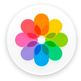
- Apple Photos on visionOS
- The petals form a recognisable foreground on a circular base.
- Apple Notes on visionOS
- The familiar yellow-topped note gives the eye a stable object to follow.
- Apple Safari on visionOS
- The compass needle has a clear relationship to the dial behind it.
Give each layer a job
Imagine a compass cut from paper: a backing circle, a dial and a needle. That order tells the viewer what to look at first. A designer leaves enough room around the front element for small shifts in perspective. Fine lettering close to the edge is easy to lose when layers move.
When depth adds meaning
A navigation, visualisation or immersive product can make good use of an icon that feels like a small object in space. Its website, invoices and store listing still need a clear front-facing image. Work out that view first, then check what depth contributes when the icon is seen from an angle.
Try a paper model
Cut three paper layers and separate them with folded card. Look straight ahead, then move slightly left and right. If the front layer hides the feature that identifies the middle one, enlarge the gap around that feature.