Brutalism
A blunt edge, dense lettering or an abrupt shift in scale can make a mark feel urgent. This direction borrows the directness of a screen-printed gig poster or a notice pasted to a wall.
Examples to look at
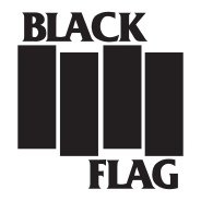
- Black Flag
- Four heavy bars create a quick, uneven beat.
- Public Image Ltd’s PiL
- The compact black-and-white monogram packs letters into a hard circular shape.
- Run-DMC
- The bold lettering and thick horizontal rules give the name a strong block-like outline.
Choose the source of the force
Black Flag’s bars get their energy from their staggered positions. Run-DMC uses the opposite move: thick rules hold the type firmly in place. These are useful references for raw graphic impact. Decide whether your own mark should feel steady, confrontational or deliberately unsettled before choosing the letters and shapes.
When directness fits
An independent venue might need a mark that survives a photocopied listing and carries across a crowded street. A severe type treatment can do both. For longer messages such as opening hours or accessibility information, pair it with quieter, easy-to-read text. The logo can do the shouting on its own.
Try a one-ink poster
Set the name at the top of a black-and-white poster and add a single line of event details underneath. Look from across the room. If the viewer can identify the act but cannot find the date up close, adjust the supporting layout.