Liquid Glass
A highlight that appears to travel around an edge gives a digital icon a different presence from a printed symbol. Apple’s Liquid Glass treatment uses layers, light and refraction to produce that impression.
Examples to look at
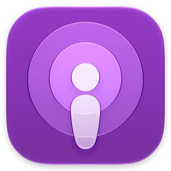
- Apple Podcasts
- The central figure and surrounding rings stay legible beneath the glass finish.
- Apple Photos
- Coloured petals provide a clear structure for the layered treatment.
- Apple Camera
- The lens gives the reflective treatment a natural focal point.
Start with what stays still
The lasting identity is the shape beneath the finish. A designer separates the foreground symbol from its background and chooses which edge should catch light. Too many shiny outlines compete for attention. For an audio app, a single broad sound-wave shape can carry the effect more clearly than a row of fine lines.
Plan for different appearances
A digital-first brand can use glass to feel responsive and polished. Review it in light, dark and tinted icon appearances and on a real phone. A parcel label or an email signature cannot reproduce changing light, so the underlying mark also needs a strong, flat version.
Try freezing the highlight
Compare a still at the brightest point with another at the darkest. Then hide the highlight entirely. The mark should remain identifiable in all three views. Select a still that also works for store listings and screenshots.