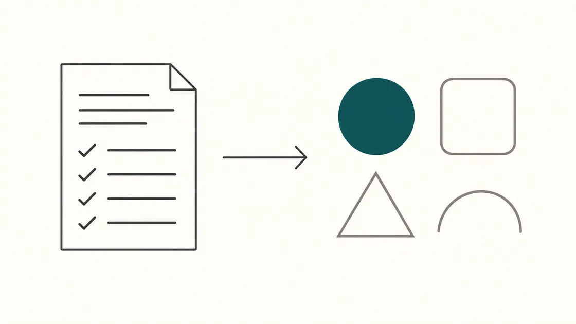
A weak or missing brief can make a logo project harder than it needs to be. The designer may produce competent work, the client may dislike it, and neither side has clear criteria for deciding what should change.
A brief gives both sides a shared starting point. It doesn’t need to be long, but it should contain the things only you know: what your business does, who you’re trying to reach, where the logo will appear, and who decides when it’s finished.
This is what to put in one. If you’re still working out whether you need a logo alone or a fuller identity, our article on logo versus brand identity covers that question first.
Why the brief matters
Three reasons, all practical.
It turns taste into criteria. “I don’t like it” is unusable. “It doesn’t work on our vans, which are dark green” is something a designer can solve. A brief converts vague preference into constraints, and constraints are what design actually needs.
It prevents late surprises. Finding out during the final round that the mark has to work embroidered on workwear, or in one colour on a stamp, may require substantial revision. Say it at the beginning and it can shape the first concepts.
It makes proposals easier to compare. When suppliers receive the same clearly stated requirements, you can compare scope, deliverables, revision arrangements, timescale and price more meaningfully.
Business name and tagline
State the exact name, spelled and capitalised as you intend to use it. “FinTaxTech” and “Fintaxtech” are different design problems.
Note whether the legal name and the trading name differ, and which one the logo should carry. A limited company called Smith Holdings Ltd trading as Riverside Joinery needs the second on its signage.
If you have a tagline, include it and say whether it must appear in the logo. Often it shouldn’t — taglines lock up badly at small sizes and date faster than the mark. A designer may offer a version with and without.
If you don’t have a tagline, say so plainly. Don’t ask the designer to invent one unless that’s in scope and priced.
What you sell
A short paragraph on what the business actually does, in the words you’d use to a customer rather than to an investor.
Include the range. A firm doing only kitchen fitting has a narrower design problem than one doing kitchens, bathrooms and loft conversions, because the second needs a mark that doesn’t tie itself to one trade.
Mention anything you plan to add. If joinery today becomes joinery and property maintenance in two years, a designer should know before making the mark a hammer.
Target customers
Be specific. “Everyone” gives a designer very little direction.
Who buys from you — homeowners, landlords, other businesses or public-sector organisations? Is the purchase quick or carefully considered? Do they buy locally, or does geography not matter? Include demographic details only when they are genuinely relevant and supported, rather than guessed.
One question does a lot of work here: what worries your customer before they choose a supplier? Price, reliability, disruption, being oversold or not being taken seriously. A logo cannot resolve those concerns by itself, but its tone should not conflict with the reassurance your wider brand needs to provide.
Brand personality
Give three to five adjectives and, more usefully, a contrast for each.
“Professional but not corporate.” “Friendly but not childish.” “Modern but not trend-chasing.” The second half of each pair tells a designer where the edge is, and that’s the part that prevents wasted rounds.
A second exercise worth doing: if your business were a shop on a high street, which shop would it be? People answer that more honestly than they answer “describe your brand values.”
Visual styles you like — and don’t
Both halves matter, and the dislikes are usually more informative.
Say whether you lean toward wordmarks (text only), a symbol with text, or a monogram. Say whether you want something illustrative or geometric, detailed or minimal.
Then name what to avoid. Common and worth stating if true: gradients, script fonts, clip-art-style icons, swooshes, globes, anything with a person silhouette, anything that looks like a technology company when you’re a bakery.
If your trade has a visual cliché you’re tired of — the tooth for dentists, the house outline for builders, the scales for solicitors — say so. Some clients want the cliché because customers recognise it instantly. That’s a legitimate choice, but it should be a choice.
Competitors and differentiation
List three to five competitors with links, and say what you think of how each of them looks.
This isn’t about copying or avoiding. It’s about position. If every competitor in your area uses navy and a serif typeface, you can either join that convention deliberately, because it signals the category, or break it deliberately, because you want to stand apart. Both are defensible. Doing it accidentally is not.
Then one sentence: what makes you different from them, in a way a customer would notice? More specialised, family-run, open at different times, or focused on a particular type of work. Only include claims you can support. A designer cannot put the whole proposition into the mark, but it can shape the wider visual direction.
Colour
Give preferences if you have them, and constraints if you have those.
Preferences are simple: colours you want, colours you refuse. If your existing vehicles, premises or workwear are a particular colour, that’s not a preference — that’s a constraint, and it should be stated as one.
Then the practical limitations, which clients rarely think to mention:
- The logo will sometimes appear on one-colour print — stamps, invoices, some signage, embroidery. It must work in solid black and solid white.
- It will sit on dark and light backgrounds. Ask for versions for each.
- Production methods have different limits. Embroidery, vinyl, screen printing and etched signage may restrict colours or fine detail. Ask the relevant supplier about its requirements.
- Screens differ. A colour chosen on your laptop will look different on a phone in sunlight.
If you already know the logo is going on workwear or a vehicle, say so here. It changes what a good answer looks like.
Where the logo will be used
List every place it will physically appear. This single section prevents more rework than anything else in the brief.
Typical list: website header, favicon, social profile pictures, email signature, invoices and quotes, business cards, letterhead, signage, vehicle livery, workwear, packaging, promotional items, trade-show materials, van magnets.
For each, note the constraint if there is one. Social platforms may crop profile images into circles. Favicons appear at very small sizes. Embroidery may lose fine detail. Vehicle livery must remain recognisable from a distance.
Also say what the logo will not be used for. Being clear that you’ll never do packaging or promotional items simplifies the job.
Formats and variations you need
State this explicitly rather than assuming. Reasonable to ask for:
- Primary logo in full colour
- Secondary or stacked version for different spaces — a horizontal mark doesn’t fit a square avatar
- Icon or monogram for small uses
- One-colour versions in black and in white
- SVG for web and any scaling
- PNG with a transparent background, at several sizes
- PDF or EPS, where requested by printers and signwriters
- Favicon
- Editable source files
Before work starts, confirm exactly which files will be delivered and what rights you will receive. In the UK, commissioning creative work does not automatically make the client the copyright owner. The creator is generally the first owner unless ownership is agreed otherwise in writing. A licence may be sufficient for some projects; a transfer of copyright requires a written, signed assignment. The UK Intellectual Property Office explains this in its guidance on ownership of commissioned copyright works.
Your agreement should therefore state whether you receive ownership or a licence, what uses are permitted, whether the designer may display the work, and whether any third-party fonts, icons or stock assets have separate licence terms. If editable source files matter to you, list them as deliverables rather than assuming they are included.
Using examples without asking for a copy
Reference images help enormously, provided you frame them correctly.
Collect five to ten logos you like from any industry, and for each write one sentence on why. “I like how simple this is at small sizes.” “I like that this uses only two colours.” “I like that this doesn’t look like a law firm.”
That sentence is the whole point. Without it, a designer sees ten images and can only guess which quality you responded to — and the safest guess is often the wrong one: that you want something similar-looking.
Frame the request as qualities, not copies. “Something with this level of simplicity” provides direction. “Something like this but for us” may encourage work that is too close to someone else’s identity and could create intellectual-property or confusion risks. References should help explain your preferences, not become templates to reproduce.
Include dislikes too, with the same one-sentence explanation.
Who approves the design
Name one person with authority to approve, and say it in the brief.
This matters more than it sounds. Design projects stall when four people give contradictory feedback and nobody can settle it. If several stakeholders must be consulted, that’s fine — gather their views, resolve the conflicts internally, and send one consolidated response per round.
Also agree: how many revision rounds are included, how feedback is delivered, and how long you’ll take to respond. A designer holding a project open for three weeks waiting on comments is a cost someone eventually pays.
What not to over-specify
A brief describes the problem. It shouldn’t attempt the solution.
Things that usually restrict a designer without improving the result:
- Specifying the symbol. “It should be a shield with a key in it” removes the exploration you’re paying for. Describe what it should convey instead.
- Naming exact fonts, unless you already have a brand typeface in use.
- Prescribing layout — which element sits where, at what angle.
- Exact hex codes, unless they’re fixed by existing assets like vehicles or premises.
- Demanding the mark ‘tell the whole story’. Logos identify; they don’t explain. Anything needing a paragraph to decode won’t survive being 32 pixels wide.
- Asking for a trend. Trends date, and rebranding costs more than getting it right once.
The distinction to hold onto: constraints from reality are useful, and constraints from imagination are not. “It must work embroidered in one colour” helps. “It must be a hexagon” doesn’t.
The logo brief checklist
- Exact business name, spelled and capitalised as intended
- Trading name if different, and which one the logo carries
- Tagline, and whether it must appear in the mark
- What you sell, in customer-facing words
- Anything you plan to add to the range later
- Who your customers are, and what worries them before they choose
- Three to five personality adjectives, each with “but not…”
- Styles you’re drawn to
- Styles and clichés to avoid
- Three to five competitors, with links and your view of each
- What makes you different, in one sentence
- Colour preferences, and any fixed by existing assets
- Whether one-colour and dark-background versions are needed
- Every place the logo will physically appear
- The smallest size it must work at
- Formats and variations required
- Agreed file deliverables and written copyright or licence terms
- Five to ten reference logos, each with one sentence on why
- The named person who approves
- Number of revision rounds, and your feedback turnaround
- Deadline, with what’s driving it
You won’t have perfect answers to all of these, and you don’t need them. A brief with honest gaps is far more useful than one padded with guesses — a designer can ask about a gap, but they’ll design around a wrong answer.
Send us your brief
If you’re preparing to commission a logo or a full identity, tell us what your business does, where the mark needs to work, and who it needs to convince. We’ll tell you what we’d need to get started — and whether a logo alone is enough for where you are.