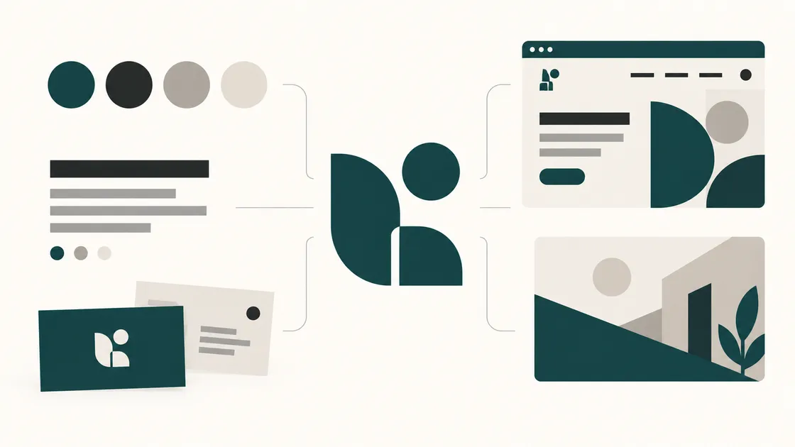
A new business owner often asks for a logo. What they may need is slightly more than that and considerably less than a full brand programme.
The gap between those two things is where a lot of money gets wasted — either on a logo that turns out to be unusable in half the places it’s needed, or on a sixty-page brand manual for a business with four customers.
This is the practical version: what a logo does, what sits around it, and what you can sensibly launch with before you know what your business will become.
What a logo actually does
A logo is an identifier. Its job is to be recognised as you, quickly, at small sizes, in places you don’t control.
That’s a narrower job than most people expect, and it’s worth being clear about what a logo does not do.
It rarely explains your business on its own. The words around it usually do that work.
It doesn’t create trust on its own. Clear business information, relevant evidence of work and an honest customer experience matter too. A polished logo cannot make up for a thin website.
It doesn’t need to contain a hidden meaning. A meaningful concept can be valuable, but not if the symbol becomes illegible at small sizes or needs a paragraph of explanation to work.
A useful test is unglamorous: does the logo work as a small social avatar or favicon, on light and dark backgrounds, and in one colour? If workwear or signage is part of your business, test those uses too. A simplified version may be needed for the smallest spaces.
What a brand identity includes
The logo is one component. The identity is the system that makes everything else look like it belongs to the same business.
Colours. A primary colour, one or two supporting colours, and neutrals for text and backgrounds. Record digital colour values and, if print matters, suitable print specifications. Important text-and-background combinations should be legible; pale grey text on white may look elegant but can be hard to read.
Typography. One or two typefaces, with defined roles for headings and body text. Check the licence for each intended use, including web embedding and logo artwork; permission for one use does not necessarily cover another. Open-licensed families are often a practical starting point.
Imagery. What your photographs or illustrations show, and how they look. Images of actual work, people or premises can help when relevant and available — a point we also make in our website launch checklist. A short direction on subject, crop and mood helps keep things consistent.
Voice. How you write. Formal or plain, first person or third, technical or everyday. Three example sentences and a short list of words you do and don’t use will do more for consistency than a page of adjectives.
Usage guidelines. The short document that prevents drift: which logo version goes on which background, minimum size, how much clear space around it, and what nobody is allowed to do — stretch it, recolour it, add a drop shadow, place it on a busy photo.
What to launch with
For many businesses just starting, this is a useful baseline. Businesses with extensive packaging, physical premises or several customer-facing teams may need more from day one.
- A primary logo, with simplified and one-colour versions where the intended uses call for them
- Files in the right formats. SVG for web and scaling, PNG with a transparent background for everyday use, and a favicon. Ask for the editable source file too, not just exports
- A small colour palette with digital values and print specifications if needed
- One or two typefaces with licences covering their actual uses
- A one-page usage note — colours, fonts, minimum size, clear space, and the things not to do
- A basic social avatar cropped from the mark, checked at the size it actually appears
That can be a short document and a folder of files. It gives a website designer, printer or social-media manager a consistent starting point without asking anyone to guess.
What can wait
A full brand manual. Thirty pages of rules for a business still deciding what it sells. Write the one-pager now; expand it when there are enough people producing material to need it.
An extensive brand strategy programme. You still need to decide who you serve, what you offer and how you want to be understood before drawing a logo. What can often wait is a large research exercise or lengthy set of personas. For a complex or highly competitive launch, deeper strategy may be worth doing immediately.
A complete stationery and collateral set. Letterheads, folders, presentation templates, vehicle livery. Commission each one when you need it.
Photography commissions. Existing, usable images may be enough at first. If your work or products must be judged visually, professional photography may be a launch essential rather than a later extra.
A tagline. Most are filler. If the right one arrives, use it; don’t pay to force it.
A scheduled rebrand. Review what works as you learn about customers, but don’t assume a full redesign after a year. A good basic identity can grow without being replaced.
Names, marks and being careful
Worth saying plainly: we’re not lawyers, and this is not legal advice. A few early checks can reveal obvious conflicts, but they are not a guarantee that a name or mark is safe to use.
Before settling on a name or mark, check relevant trade-mark registers for similar names and marks in the markets where you plan to trade. For a UK launch, use the UK Intellectual Property Office’s trade-mark search and check Companies House for similar company names. Also check domain and social-handle availability, and search the web for similar brands in your field. If you will trade elsewhere, check the relevant territories too: a UK trade mark does not protect a brand overseas.
Registering a company at Companies House is not the same as registering a trade mark. A quick search, meanwhile, does not amount to legal clearance or confirm that no one has rights in a similar brand.
If the brand is central to a long-term plan — for example, you intend to franchise, license or expand internationally — consider a qualified trade-mark attorney before committing to a name. The UK IPO recommends professional advice if you find a similar mark. Free searches are a useful first screen, not a substitute for advice when the stakes are high.
How we use AI-assisted concepts
We use AI tools in the early stages of identity work, and we’re straightforward about where they help and where they don’t.
Where they help. Exploring early visual directions, colour combinations and layout possibilities. They can give us material to discuss before we develop a selected direction. The number of concepts, revisions and deliverables is set in the project proposal, not assumed from the use of AI.
Where they don’t. A generated concept is not automatically a finished or usable mark. We review and refine the chosen direction, prepare the agreed final files, and test the artwork in the sizes and settings named in the brief. Where scalable vector artwork is part of the agreed deliverables, it must be prepared as such; a raster export alone is not equivalent.
What we won’t tell you. That an AI-assisted logo is automatically unique, registrable as a trade mark or free of third-party rights. Similarity checks matter whatever tool produced the concept. Copyright treatment of AI-assisted and computer-generated work varies by jurisdiction; UK guidance distinguishes the two, and no design process can promise protection in every market.
So the checks above still apply, whatever produced the first sketch. Speed in the concept stage doesn’t remove the diligence at the end of it.
Before you commission anything
- The one-sentence description of what your business does and who for
- Your proposed business name and where you intend to trade
- Domain and social handles checked for availability
- Relevant trade-mark and business-name searches completed; professional advice considered if conflicts appear
- Three brands you admire, with a sentence each on why
- Two or three you actively dislike — often more useful than the first list
- Where the logo will physically appear: website, signage, vehicles, workwear, invoices, packaging
- The smallest place it has to work, and whether it ever needs to be one colour
- Whether you need print, web, or both — it affects colour and font decisions
- Which editable source files are included, and what rights transfer on payment
- Confirmation that font licences cover how you’ll actually use them
- A clear list of the items you need at launch, so proposals cover the same scope
Before agreeing to a quote, check exactly which editable files and rights you will receive, when they transfer, and which third-party licences remain in place. Paying for design work does not, by itself, always transfer copyright: in the UK, a copyright assignment must be in writing and signed by the owner. With FinTaxTech, ownership of agreed final deliverables passes after full payment, subject to third-party licences; our internal prompts, workflows and methods remain ours. The written proposal sets out the details.
Tell us about your project
If you’re starting a new business or rebranding an existing one, the useful conversation isn’t about what the logo should look like. It’s about where it has to work, who it has to convince, and how much of an identity you actually need right now.